I don't always get to work on mobile projects, but when I do they're websites pretending to be apps.

So the question is: If your schedule is too tight to get a simple phonegap application through the approval process, how do you deliver a great mobile experience to users on launch day?
Responsive design will only get you so far. Which is to say not very far at all.
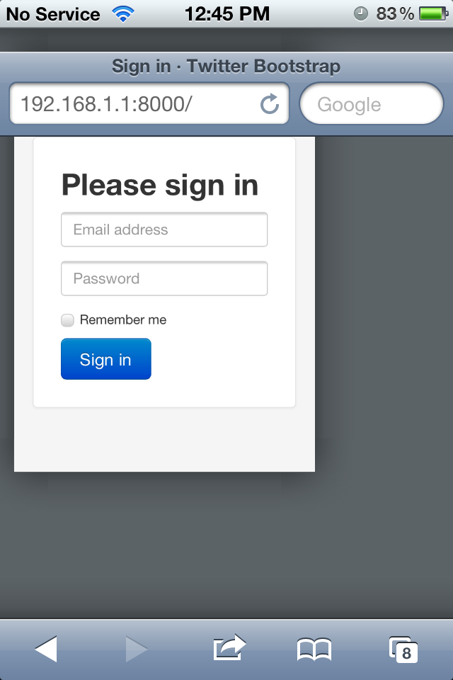
Take Bootstrap, use all the responsive features and you are left with a website that looks a bit different on a phone than it does on a computer or a tablet. But it's no app.
- renders super small despite the initial-scale=1.0 meta tag
- scrolls all over the place
First step to fixing things is disabling user scalability:
<meta
name="viewport"
content="width=device-width, initial-scale=1.0, user-scalable=no, maximum-scale=1.0"
/>
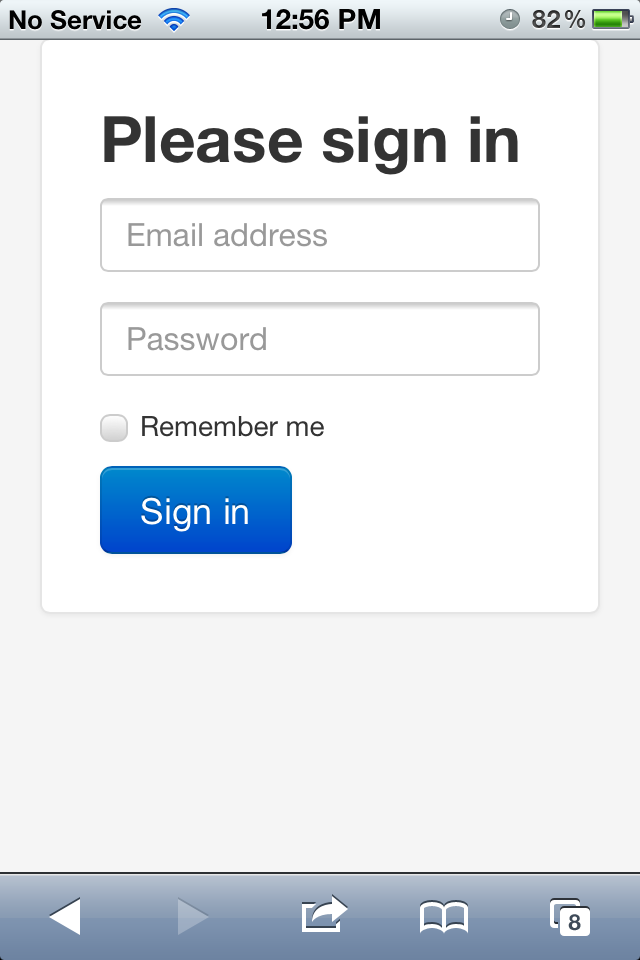
Default zooming is okay now and users can't pinch-to-zoom anymore. But they can still do plenty of strange side-scrolling and bouncing around. Something apps don't usually do.
Adding another meta tag fixes that problem.
<meta name="apple-mobile-web-app-capable" content="yes" />
Our only problem now is that pesky address bar on the top. Apps don't have that! This can be solved with a bit of simple javascript:
// When ready...
window.addEventListener("load", function () {
  // Set a timeout...
  setTimeout(function () {
    // Hide the address bar!
    window.scrollTo(0, 1);
  }, 0);
});
Marvelous! You even get an extra 60 pixels of room to play with.
Just keep in mind that you must use those 60 pixels, otherwise the address bar won't hide because there's nothing to scroll up.

Continue reading about How to tell a phone your website is an app
Semantically similar articles hand-picked by GPT-4
- Firefox's "funny" css3 image scaling quirk
- Why websites and webapps are different
- Doing nothing is the hardest thing ever
- Single page web apps: the worst of both worlds
- Appcelerator Titanium might've made it to my toolbox
Learned something new?
Read more Software Engineering Lessons from Production
I write articles with real insight into the career and skills of a modern software engineer. "Raw and honest from the heart!" as one reader described them. Fueled by lessons learned over 20 years of building production code for side-projects, small businesses, and hyper growth startups. Both successful and not.
Subscribe below 👇
Software Engineering Lessons from Production
Join Swizec's Newsletter and get insightful emails 💌 on mindsets, tactics, and technical skills for your career. Real lessons from building production software. No bullshit.
"Man, love your simple writing! Yours is the only newsletter I open and only blog that I give a fuck to read & scroll till the end. And wow always take away lessons with me. Inspiring! And very relatable. 👌"
Have a burning question that you think I can answer? Hit me up on twitter and I'll do my best.
Who am I and who do I help? I'm Swizec Teller and I turn coders into engineers with "Raw and honest from the heart!" writing. No bullshit. Real insights into the career and skills of a modern software engineer.
Want to become a true senior engineer? Take ownership, have autonomy, and be a force multiplier on your team. The Senior Engineer Mindset ebook can help 👉 swizec.com/senior-mindset. These are the shifts in mindset that unlocked my career.
Curious about Serverless and the modern backend? Check out Serverless Handbook, for frontend engineers 👉 ServerlessHandbook.dev
Want to Stop copy pasting D3 examples and create data visualizations of your own? Learn how to build scalable dataviz React components your whole team can understand with React for Data Visualization
Want to get my best emails on JavaScript, React, Serverless, Fullstack Web, or Indie Hacking? Check out swizec.com/collections
Did someone amazing share this letter with you? Wonderful! You can sign up for my weekly letters for software engineers on their path to greatness, here: swizec.com/blog
Want to brush up on your modern JavaScript syntax? Check out my interactive cheatsheet: es6cheatsheet.com
By the way, just in case no one has told you it yet today: I love and appreciate you for who you are ❤️

