Building emails sucks.
Last week I was tasked with a project. "We're rebranding, our emails were built 3 years ago and they look janky. Let's rebuild!"
"OK I can do that. But emails suck so I'm def not building that shit from scratch"
Our designer built an email template in BeePro. Visual email builder, exports to HTML, promises that everything will work on all email clients, on both web and mobile, and look good no matter what you do.
Wonderful. Look at us being a responsible team and avoiding all the hard finicky stuff.
I look at the template and think "Ok, central body area, some optional pre_body stuff, some optional post_body stuff. Body made out of a few basic widgets."

To avoid bloating up our codebase and make it easier to build many different emails that look just like this, I cut it up into a few Ruby on Rails partials. A basic layout for the email with hooks for pre and post body stuff, a header partial, a title partial, an information row partial, stuff like that.
All my partials were built through careful copy and paste. Inspect the exported HTML, cut out a relevant section, fill dynamic info with erb. Easy peasy.
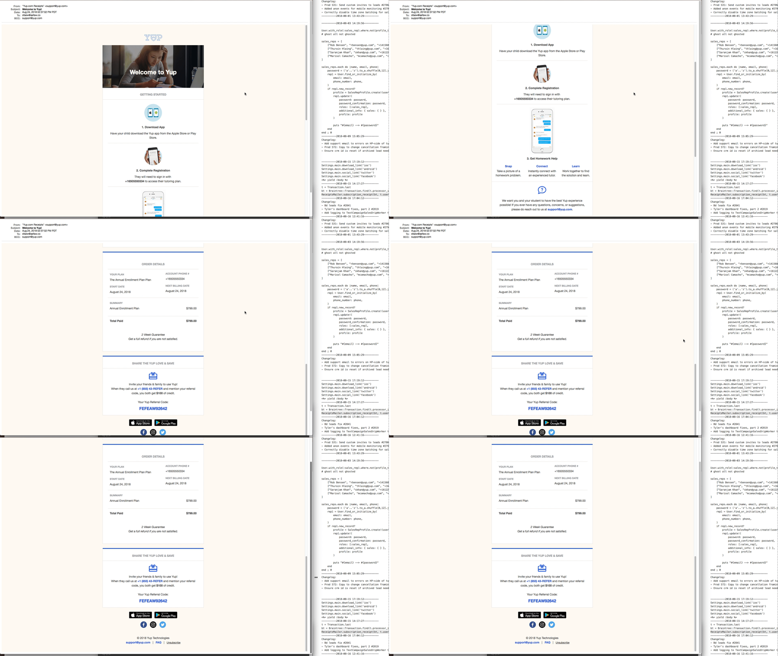
Here's what the emails looked like in my test environment. Opening as a browser tab instead of sending via SMTP. 👇
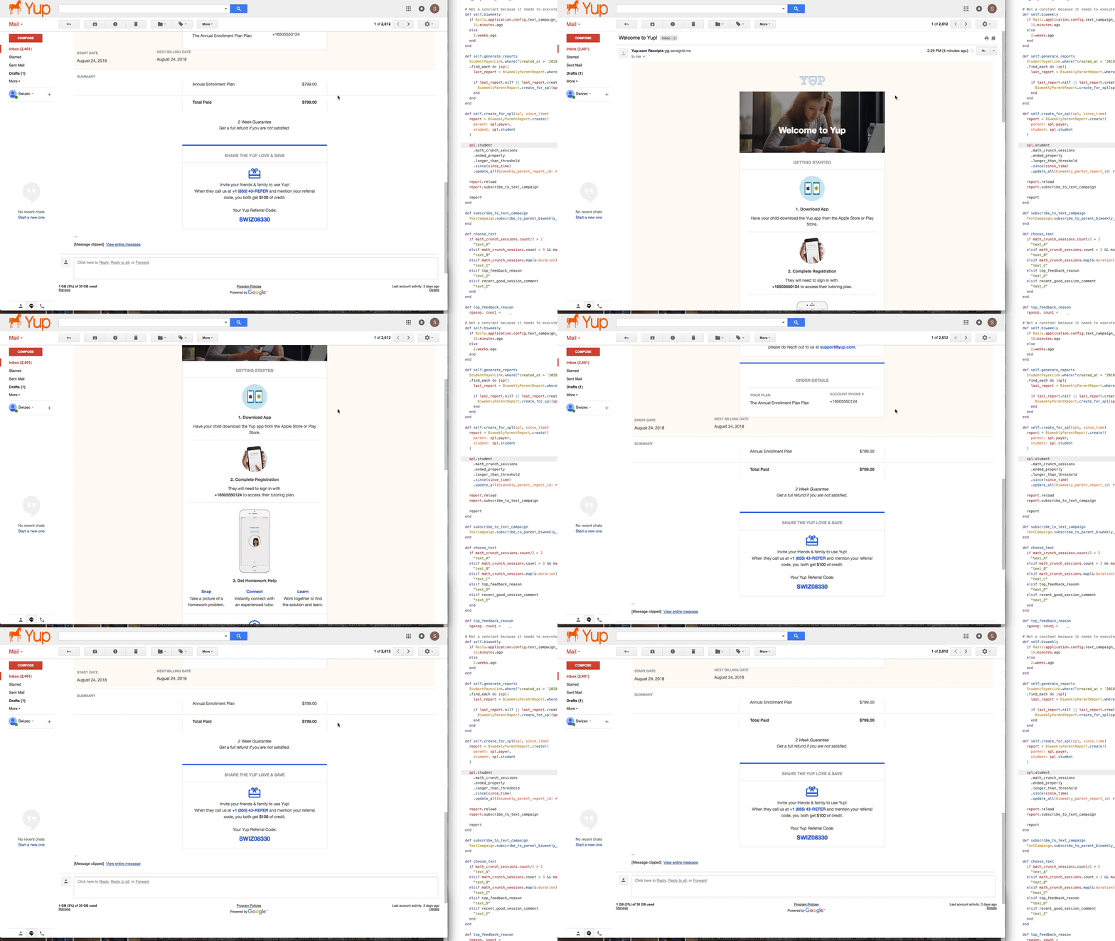
And here's what that same email looked like in GMail when my QA team tried it out.
...
Ok, breathe, zennnnn. We can fix this.
The problem is that BeePro builds weird HTML that I had to tweak a little and that email clients take out some of your CSS. Sometimes they tweak HTML to make it more correcter.
You see BeePro doesn't think in boxes like you and I do. It thinks in full width divs and fakes containers.

Tweaked a few things, moved some CSS around, copy pastad some more HTML. Fixed the email yay!
Looks great in GMail on the desktop. Surely it's fine everywhere.


Now here's the thing, you can't inspect elements in the GMail app on your phone. You can't even tell what's rendering, why things are doing what they're doing, or where any of the elements are.
A-ha! I'll open GMail on my computer, set my viewport to iPhone size, and debug that way! Modern web development tools to the rescue. Huzzah 💪
GMail is too smart
Nope. GMail sees it's running in web mode and scales down your email instead of forcing it to reflow. I don't know how, but it does. Email looks like the desktop version, just smaller.
Luckily I'm an old skool web developer. We didn't have tools when I started. I know how it goes!
Back when PHP scripts returned a blank screen, if you had an error. Because showing errors on the web leads to security issues, you see. Back when browsers didn't come with developer tools until someone built FireBug for FireFox.
Fun times.
Those arcane skills came useful once more.
In a nutshell 👇
- Guess which element is a problem
- Add a border
- Send email
- Check on phone
- Refine guess, goto 1
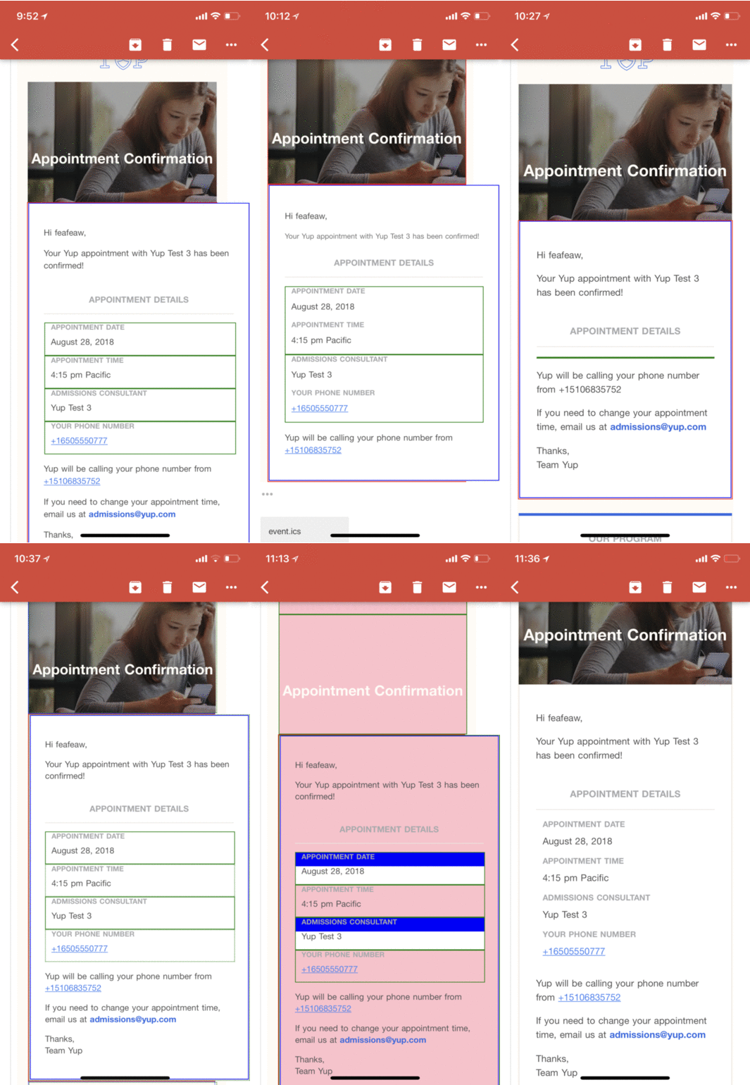
1px solid red is always my first try. Then I move on to blue and green and dotted and dashed and all sorts of things until I understand how things are rendering and why. Each time you tweak some CSS, some HTML, and move things around.
When you're inspecting paddings and margins, you opt for pink and blue and white backgrounds. Background for the big div, background for the small div, hey presto margins and paddings show up. yay
Sometimes you take things out to see if they're pushing stuff around. Binary search through the HTML tree to see which line is causing problems.
It took me 57 iterations. Here's a gif. Enjoy 👇

I may have lost my sanity, I may have begged on twitter for a bullet to the head, but by joe I got it done. The email is damn well perfect.
Now watch as I walk into work this morning and QA says it doesn't work.
Continue reading about The most frustrating debugging experience I've had all year
Semantically similar articles hand-picked by GPT-4
- Sometimes your worst code is your best code
- Are you annoyed by the extra space after your name [name|]?
- Oh the things you can learn with a fun weekend hack project 🏗
- Famous last words: Pfft, that's easy
- 5 apps with the modern web stack
Learned something new?
Read more Software Engineering Lessons from Production
I write articles with real insight into the career and skills of a modern software engineer. "Raw and honest from the heart!" as one reader described them. Fueled by lessons learned over 20 years of building production code for side-projects, small businesses, and hyper growth startups. Both successful and not.
Subscribe below 👇
Software Engineering Lessons from Production
Join Swizec's Newsletter and get insightful emails 💌 on mindsets, tactics, and technical skills for your career. Real lessons from building production software. No bullshit.
"Man, love your simple writing! Yours is the only newsletter I open and only blog that I give a fuck to read & scroll till the end. And wow always take away lessons with me. Inspiring! And very relatable. 👌"
Have a burning question that you think I can answer? Hit me up on twitter and I'll do my best.
Who am I and who do I help? I'm Swizec Teller and I turn coders into engineers with "Raw and honest from the heart!" writing. No bullshit. Real insights into the career and skills of a modern software engineer.
Want to become a true senior engineer? Take ownership, have autonomy, and be a force multiplier on your team. The Senior Engineer Mindset ebook can help 👉 swizec.com/senior-mindset. These are the shifts in mindset that unlocked my career.
Curious about Serverless and the modern backend? Check out Serverless Handbook, for frontend engineers 👉 ServerlessHandbook.dev
Want to Stop copy pasting D3 examples and create data visualizations of your own? Learn how to build scalable dataviz React components your whole team can understand with React for Data Visualization
Want to get my best emails on JavaScript, React, Serverless, Fullstack Web, or Indie Hacking? Check out swizec.com/collections
Did someone amazing share this letter with you? Wonderful! You can sign up for my weekly letters for software engineers on their path to greatness, here: swizec.com/blog
Want to brush up on your modern JavaScript syntax? Check out my interactive cheatsheet: es6cheatsheet.com
By the way, just in case no one has told you it yet today: I love and appreciate you for who you are ❤️
