


One of the most common burning questions readers ask 👉 "How do I add tooltips to my charts?" followed by "How do I sync them between multiple charts?"
So we played around and got that working on a stream 👇
Using hooks because why not. It's fun to experiment with the future :)
We built a simple dashboard with 3 scatterplots because scatterplots are easy to build. Filled with random data because real small datasets are hard to find.
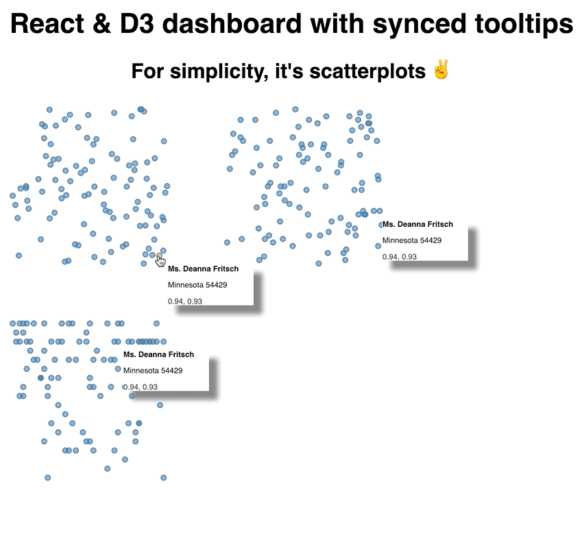
Scatterplots with synchronized tooltips
Here's a CodeSandbox, try it out 👇
First, you need a context and some state
We're using context to share state between charts. No prop passing, just state that everyone has access to. It's like a Redux or MobX store without the setup.
A couple lines is all we need:
// src/useTooltip.js
import React, { useState } from "react";
const tooltipContext = React.createContext();
function useTooltip() {
const [tooltip, setTooltip] = useState(false);
return { tooltip, setTooltip };
}
export { useTooltip, tooltipContext };
Not sure yet how I feel about this state pattern with hooks, need to play around some more. Here's the idea:
- Create a
tooltipContext - Create a custom
useTooltiphook with 1 piece of state, the tooltip value - Return value and setter from the hook
- Export hook and context
Might look cleaner to export context in the useTooltip hook itself? 🤔
Either way, the idea here is that every component has access to the same tooltip state. It tells them whether to display a tooltip and its context. Any component can take over, usually on mouse over, and call setTooltip to set a new tooltip.
If your system has just 1 mouse cursor, like most computers do, this approach works great. If you want to support multiple simultaneous mouse over events, you could run into trouble.
Second, you need a scatterplot
Like I said, we used scatterplots because they're quick to build. Take some data, pick two dimensions, iterate and draw circles.
// src/Scatterplot.js

import { tooltipContext } from "./useTooltip";

export default ({
  x,
  y,
  width,
  height,
  data,
  xDimension,
  yDimension,
  padding = 10
}) => {
  const { tooltip, setTooltip } = useContext(tooltipContext);

  const xScale = d3
    .scaleLinear()
    .domain(d3.extent(data, xDimension))
    .range([padding, width - padding]);
  const yScale = d3
    .scaleLinear()
    .domain(d3.extent(data, yDimension))
    .range([padding, height - padding]);

  return (
    <g transform="{`translate(${x}," ${y})`}="">
      {data.map(d => (
        <circle key={d.id} cx={xScale(xDimension(d))} cy={yScale(yDimension(d))} r={3} onmouseover="{()" ==""> setTooltip(d)}
          onMouseOut={() => setTooltip(false)}
        />
      ))}
      {tooltip && (
        <tooltip x={xScale(xDimension(tooltip))} y={yScale(yDimension(tooltip))} info={tooltip}>
      )}
    </tooltip></circle></g>
  );
};
We use the useContext hook to get access to our tooltip state. Here's where using useTooltip would be nicer but I couldn't quite figure out how to make it work.
That gives us tooltip and setTooltip. I'll show you how they get into our context in a bit.
Then we set up two D3 scales: One for horizontal coordinates, xScale, one for vertical coordinates, yScale.
We return a grouping element using the transform prop to position at (x, y), iterate over our data, and render circles.
Each circle gets a position based on our scale and a passed-in value accessor. xDimension or yDimension. This lets us re-use the same scatterplot for random looks into our data you'll see. onMouseOver we set the tooltip to current datapoint, onMouseOut we reset it back to false.
Then we render the ``component.
Third, you need a``
The ``component takes coordinates and content. Renders them in an SVG foreignObject so we can leverage HTML's built-in text formatting abilities.
Reflowing text in SVG yourself is painful 😉
// src/Scatterplot.js

const Tooltip = ({ x, y, info }) => (
  <foreignobject x="{x" +="" 10}="" y="{y" width={100} height={50}>
    <div>
      <strong>{info.name}</strong>

        {info.state} {info.zipCode}

      <p style={{ color: info.color }}>
        {info.number1.toFixed(2)}, {info.number2.toFixed(2)}
      </p>
    </div>
  </foreignobject>
);
This one is very dataset specific. We know each info has a name, a zipCode, and two numbers. Display them in some nice format and that's that.
Each of our scatterplots now has its own instance of a tooltip. They're all driven by the same state in context, but they're different tooltips.
This is crucial.
Fourth, you need an App to hold it all together
Our App component holds everything together. Generates data, renders scatterplots, sets up a context provider. Everything.
Looks like this
function App() {
  // Generate random data on first load
  const data = useMemo(
    () =>
      range(100).map(i => ({
        id: i,
        number1: Math.random(),
        number2: Math.random(),
        name: Faker.name.findName(),
        zipCode: Faker.address.zipCode(),
        state: Faker.address.state(),
        color: Faker.internet.color()
      })),
    []
  );

  // bucketize states into 50 buckets
  const stateToNumber = scaleOrdinal()
    .domain(data.map(d => d.state))
    .range(range(50));

  // alphabetize letters into 25 buckets
  const alphabet = scaleOrdinal()
    .domain("abcdefghijklmnoprstuvwxyz".split(""))
    .range(range(25));

  const state = useTooltip();

  return (
    <div class="App">
      <h1>React & D3 dashboard with synced tooltips</h1>
      <h2>For simplicity, it's scatterplots ✌️</h2>
      <tooltipcontext class="provider" value={state}>
        <svg width="800" height="600">
          <scatterplot x={0} y={0} width={200} height={200} data={data} xdimension="{d" ==""> d.number1}
            yDimension={d => d.number2}
          />

          <scatterplot x={250} y={0} width={200} height={200} data={data} xdimension="{d" ==""> d.number1}
            yDimension={d => stateToNumber(d.state)}
          />

          <scatterplot x={0} y={250} width={200} height={200} data={data} xdimension="{d" ==""> stateToNumber(d.state)}
            yDimension={d => alphabet(d.name[0])}
          />
        </scatterplot></scatterplot></scatterplot></svg>
      </tooltipcontext>
    </div>
  );
}
So that's a long ass function. This is our hook-based future I'm afraid. Surely patterns will develop to clean this stuff up?
But also we were just playing around. No need to make it clean :)
We start with some fake data. useMemo makes sure we calculate it once and keep it in memory through any re-renders. Makes our dataviz look more consistent.
Two ordinal scales help us turn state names and zip codes into linear numbers. Easier than changing our scatterplots to support ordinal data.
The useTooltip hook from earlier gives us a state object that we'll feed into our tooltipContext. Again a good opportunity to make this easier to use, but need to play around some more.
For the rendering, we wrap our dashboard with tooltipContext.Provider, give it our state, render an SVG element, and plop down three scatterplots.
This is where making scatterplots flexible comes handy. We're reusing the same component, giving it different params, and it gives us different insights into the same dataset.
The result, a dashboard with synchronized tooltips.
Scatterplots with synchronized tooltips
✌️
In other news
I DID IT I FINISHED EDITING ALL EIGHT HOURS OF VIDEO FOR React For Data Visualization \o/

Only took 4 months, heh 😅
But now we know. This is a good datapoint for the future.
The process started in August with research, writing, running online workshops to test the material and flow. Well, the real process started in April 2015 with the first React + D3 book …
Fingers crossed it doesn't take me 4 years to produce the next full video course 🤞 I think the 5 month flow is doable.
Right now we've got 94 videos in 27 sections and 133 lessons. Today I'm recording a couple explainer intro videos to give context and ease onboarding and then we're off to the races launching this thing.
Thanks everyone for your patience. Watch your emails for more info coming soon :)
Oh also I started ramping up for another marathon because I'm dumb

A few TIL lessons from the week
These days I post a cool tip in the form of a TodayILearned on twitter every day. Here are some good ones from this week. Click on them, they're threads 👇


This one has some cool CompSci fundamentals ^

This one is an epic mystery with a weird resolution
A few cool things
And as always on a Monday, some cool stuff I discovered this week 👇
Script-8 which is a whole 8-bit computer built in JavaScript. Great for making retro games.
dmaydan published this neat maze builder and solver that renders on canvas. If you find that cool, you'll enjoy Bostock's epic maze generation algorithms article.
This is C++ but I really liked it: A KABOOM animation in 180 lines of C++. Neat effect and good writeup on how to get there.
And I think this is a cool idea, but I haven't had time to listen to the episodes. A React learning course compiled out of podcasts
Hope you have a great week. and to that person who asked Do you even read these? in the typeform below: Yes I do but I can't reply.
Cheers,
~Swizec
Continue reading about Tooltips and state across various d3 charts in a React dashboard!
Semantically similar articles hand-picked by GPT-4
- Tooltips ... tooltips are not so easy 🧐
- Livecoding Recap: A new more versatile React pattern
- Building a React dataviz with React hooks
- Livecoding #19: It’s hard to package a library
- How to drive React state with D3 transitions for complex animation
Learned something new?
Read more Software Engineering Lessons from Production
I write articles with real insight into the career and skills of a modern software engineer. "Raw and honest from the heart!" as one reader described them. Fueled by lessons learned over 20 years of building production code for side-projects, small businesses, and hyper growth startups. Both successful and not.
Subscribe below 👇
Software Engineering Lessons from Production
Join Swizec's Newsletter and get insightful emails 💌 on mindsets, tactics, and technical skills for your career. Real lessons from building production software. No bullshit.
"Man, love your simple writing! Yours is the only newsletter I open and only blog that I give a fuck to read & scroll till the end. And wow always take away lessons with me. Inspiring! And very relatable. 👌"

Have a burning question that you think I can answer? Hit me up on twitter and I'll do my best.
Who am I and who do I help? I'm Swizec Teller and I turn coders into engineers with "Raw and honest from the heart!" writing. No bullshit. Real insights into the career and skills of a modern software engineer.
Want to become a true senior engineer? Take ownership, have autonomy, and be a force multiplier on your team. The Senior Engineer Mindset ebook can help 👉 swizec.com/senior-mindset. These are the shifts in mindset that unlocked my career.
Curious about Serverless and the modern backend? Check out Serverless Handbook, for frontend engineers 👉 ServerlessHandbook.dev
Want to Stop copy pasting D3 examples and create data visualizations of your own? Learn how to build scalable dataviz React components your whole team can understand with React for Data Visualization
Want to get my best emails on JavaScript, React, Serverless, Fullstack Web, or Indie Hacking? Check out swizec.com/collections
Did someone amazing share this letter with you? Wonderful! You can sign up for my weekly letters for software engineers on their path to greatness, here: swizec.com/blog
Want to brush up on your modern JavaScript syntax? Check out my interactive cheatsheet: es6cheatsheet.com
By the way, just in case no one has told you it yet today: I love and appreciate you for who you are ❤️