


Modern CSS-in-JS is the best thing that's happened to the web since components. Hands down. Let me explain. 👇
First we had the style prop and that sucked. I hated CSS-in-JS and thought it was stupid. You can pry my CSS from my dead cold hands! shakes fist
Then came experiments.
Can we make the style prop easier to use? Can we still use class names to style with BEM like we used to? What about CSS files with fat semantic classes? Scoped styles maybe?
None of it quite worked. Everything was awkward in some way.
The style prop is great for individual components and breaks down when you want to change your general font size.
Class names give you all the power of CSS and BEM (tiny classes like .font1 .bold .bla). And it breaks down when you reuse components like building blocks. A component has the color defined and if you want to overwrite that you need something that understands classes and decides which one takes power and ugh don't get me started.
I may have once tried to make that work ...
Scoped CSS is better. That's what Vue uses. But it still sucks, if you ask me. You get a weird mix of global styles with local overwrites and mixing BEM and semantic classes and it gets messy fast. Leads to weird code too.
But then, then some beautiful soul came up with styled-components. I was in love.
All the simplicity of scoped CSS with the power of the style prop. You write CSS, yes, but you can inject JavaScript too.

Why styled-components are win, an example
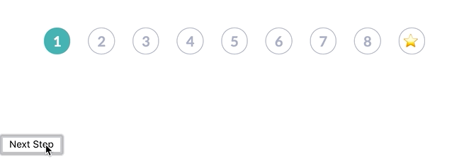
The best way to make my argument is with an example. I recently implemented a colorful React stepper component for a client project.
Styled components and a couple libraries @Diegohaz built on top made it so easy it feels like cheating.
Wow @diegohaz's libs made this ridiculously easy to build. Blog coming soon pic.twitter.com/Cpp7LoMrHC
— Swizec Teller (@Swizec) January 29, 2019
You have 9 steps. Each a different color once done. Blank with a grey outline otherwise.
Here's a CodeSandbox you can try.
Pretty isn't it? I think it is.
Here's all the component code 👇
const Step = ({ index, done, last }) => (
  <Circle index={index} done={done} last={last}>
    {last ? "⭐️" : index + 1}
  </Circle>
)

export default ({ step, maxSteps }) => (
  <Steps row>
    {range(maxSteps).map((i) => (
      <Step index={i} key={i} last={i === maxSteps - 1} done={i < step} />
    ))}
  </Steps>
)
Yep that's it. 12 lines of code.
A <Stepper> component, the default export, takes the current step and max number of steps, maxSteps. It renders a <Steps> component which deals with layouting. Inside goes an array of <Step>s.
Each <Step> gets an index, a flag saying whether it's last, and whether it's been done yet. Highlighted vs. unhighlighted state.
Steps render a <Circle> component, pass-in the props, and inside goes either a number or a star emoji. Star is last.
All style logic goes in styles
Moving your visual UI logic out of your components and into styles is where CSS-in-JS shines. Focus your components on business logic, user experience, and hierarchy. Let your styles take care of your styling.
Just like our CSS Garden forebears envisioned. Remember CSS Gardens?
You might be too young. The world has moved on. CSS's initial promise is that we would completely decouple styling from document hierarchy and live a Zen stress free life.
Now look at us.
BUT ALL IS NOT LOST! Look at this beauty.
import { Box, Flex, Heading, styled } from "reakit"

const Steps = styled(Flex)`
  align-items: center;
  justify-content: center;
  padding-top: 40px;
`
I'm using Diegohaz's reakit for base CSS stuff. He built a bunch of components on top of styled-components that have sane defaults and great composability.
No styles, just some basics. Flex, for example, is a div with display: flex. That's all.
<Steps> then is a flexbox div that centers its children and adds a 40px padding on top.
Easy 👌
And then comes the <Circle> component. The individual steps.
import { theme, palette, withProp, ifProp } from "styled-tools"

const Circle = styled(Box)`
        border-radius: 100%;
        border: 1px solid;
        border-color: ${ifProp(
          "done",
          withProp("index", (index) => palette("steps", index)),
          palette("grey", 2)
        )}
        color: ${ifProp("done", "white", palette("grey", 2))};
        background: ${ifProp(
          "done",
          withProp("index", (index) => palette("steps", index)),
          "white"
        )}
        font-size: ${palette("size", 1)};
        ${theme("bold")}
        width: 30px;
        height: 30px;
        line-height: 30px;
        text-align: center;
        margin-right: 20px;

        &:last-child {
            margin-right: 0px;
        }
    `

A few things are happening here. Let me explain.
- I'm using another of Diegohaz's libraries styled-tools. It's a suite of helper functions that make it easier to use component props from your CSS-in-JS styles
- I'm using a theme behind the scenes. A concept built into Reakit that lets you define global styles. Things like UI colors, font sizes, stuff like that.
- ALL of my visual logic is in this style
Let's break it down.
We start with a Box, which is just a div.
const Circle = styled(Box)`
Then we turn it into a circle with a border.
border-radius: 100%;
border: 1px solid;
Border and background color come from our theme, based on the combination of index and done props.
    border-color: ${ifProp(
            "done",
            withProp("index", index => palette("steps", index)),
            palette("grey", 2)
        )}
        background: ${ifProp(
            "done",
            withProp("index", index => palette("steps", index)),
            "white"
        )}
Here's how you read that:
- If prop
doneis true, get first argument, otherwise the second. - With prop
indexrun method. - Get the
stepspalette from theme and take theindexcolor. - Otherwise, get the
greypalette and take the2nd color
Palettes are arrays in your theme object. Pure JavaScript. You can see it in the CodeSandbox above.
A similar process gives you the font color.
color: ${ifProp("done", "white", palette("grey", 2))};
If step is done, color is white, otherwise the 2nd color from the grey palette.
Then we have font size, bold fonts, widths and heights, and other normal CSS stuff to round off each step.
    font-size: ${palette("size", 1)};
        ${theme("bold")}
        width: 30px;
        height: 30px;
        line-height: 30px;
        text-align: center;
        margin-right: 20px;

        &:last-child {
            margin-right: 0px;
        }
    `;
You can still use CSS nesting and meta classes just like you're used to. &:last-child matches the last <Step> and removes its margin so it doesn't mess with the layout.
👌
Conclusion
This flavor of CSS-in-JS is the best most ridiculously easy way I've ever seen to style modern JavaScript components. I pray that it works for Vue as well as it does for React because I want to get my frontend peeps at the dayjob excited about it.
To recap:
- Components deal with business logic and UX
- Styles handle all visual logic
- Global theme handles generics
Yes that means you ca rebrand your whole app just by changing theme.js.

Continue reading about Why CSS-in-JS is winning, an example
Semantically similar articles hand-picked by GPT-4
- Build a new design system in a couple afternoons
- Getting the CSS out of rendered React components
- Why dataviz does better for your career than TODOapps
- Svelte takes the best of React and the best of Vue to make something awesome
- Build responsive SVG layouts with react-svg-flexbox
Learned something new?
Read more Software Engineering Lessons from Production
I write articles with real insight into the career and skills of a modern software engineer. "Raw and honest from the heart!" as one reader described them. Fueled by lessons learned over 20 years of building production code for side-projects, small businesses, and hyper growth startups. Both successful and not.
Subscribe below 👇
Software Engineering Lessons from Production
Join Swizec's Newsletter and get insightful emails 💌 on mindsets, tactics, and technical skills for your career. Real lessons from building production software. No bullshit.
"Man, love your simple writing! Yours is the only newsletter I open and only blog that I give a fuck to read & scroll till the end. And wow always take away lessons with me. Inspiring! And very relatable. 👌"

Have a burning question that you think I can answer? Hit me up on twitter and I'll do my best.
Who am I and who do I help? I'm Swizec Teller and I turn coders into engineers with "Raw and honest from the heart!" writing. No bullshit. Real insights into the career and skills of a modern software engineer.
Want to become a true senior engineer? Take ownership, have autonomy, and be a force multiplier on your team. The Senior Engineer Mindset ebook can help 👉 swizec.com/senior-mindset. These are the shifts in mindset that unlocked my career.
Curious about Serverless and the modern backend? Check out Serverless Handbook, for frontend engineers 👉 ServerlessHandbook.dev
Want to Stop copy pasting D3 examples and create data visualizations of your own? Learn how to build scalable dataviz React components your whole team can understand with React for Data Visualization
Want to get my best emails on JavaScript, React, Serverless, Fullstack Web, or Indie Hacking? Check out swizec.com/collections
Did someone amazing share this letter with you? Wonderful! You can sign up for my weekly letters for software engineers on their path to greatness, here: swizec.com/blog
Want to brush up on your modern JavaScript syntax? Check out my interactive cheatsheet: es6cheatsheet.com
By the way, just in case no one has told you it yet today: I love and appreciate you for who you are ❤️