

Last night I built something so cool it's still blowing my mind. And I got the idea from the flat earth society. Wat
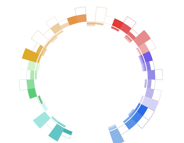
It's a donut chart that transitions to a bar chart. Same component, same React code, different radius. 29,905px instead of 728px. 🤯
I actually got the idea from that flat earth documentary on Netflix. Behind the Curve. No joke.
Sure, I haven't watched it yet but the twitter buzz put flatearthers on my mind. Apparently there's a scene where they confidently disprove their own theory and it's pure gold.

Gotta watch this for the lulz 😂
Why do flat earth people believe the earth is flat?
It's because the curve is soooooooo big that it looks flat.
That gave me an idea for a client project I've been working on. They asked me to build a smooth transition from a donut-shaped visualization to a bar chart shape.
No idea how to pull that off so I built eeeeverything else first. Sometimes that's just how it be. You put the hardest things off as long as you can get away with 😇
And then I made a break through.
I just discovered a new approach to React + D3 transitions 🤯 Of course this happens juuuust when I think React for Data Visualization is complete
— Swizec Teller (@Swizec) March 5, 2019
Check this out, it combines the "game loop via state changes" with the "D3 runs transitions" approach pic.twitter.com/mMglR4hDwp
You can combine the two approaches to animation I teach in React for Data Visualization
React for Data Visualization and my workshop teach you about two ways to animate in dataviz:
- The game loop approach. Borrows ideas from the gaming industry. Call
this.setState60 times per second and your React component animates. Wonderful.
- The D3 transition approach. You take a React component, use props as a staging area, render from state, and use
componentDidMountoruseEffectto hand rendering control over to D3. D3 runs its transition, manipulates the DOM directly, then hands control back to React.
A new approach to complex transitions
Now there's a 3rd approach. Something I never thought of before and it works beautifully. Adding it to React for Data Visualization this weekend ✌️
Let's look at the transition again
Here's what happens behind the scenes to make that work:
- A
<Donut>component renders a bunch of<Arc>s - Each
<Arc>takes care of its complex shape. Built from 3 different D3 arc generators - The whole thing is driven by D3's pie generator. It calculates start and end angles for individual arcs
- Donut size is a function of radius. The bigger the radius, the bigger the donut.
- As the radius increases from 728 to 29,905 the donut grows
- And it moves down as fast as it grows. Without moving it would fly off the screen and you'd never see it again
- To keep the pie exactly 728px wide even though it's rendered on a 29,905px donut ... well you gotta calculate the arc segment and derive start and end angles from that
🤯
That's a lot of stuff.
And it's all driven by this code. The transition 👇

I call this on component mount. Could be on a click event or whatever. Starts a custom tween transition with D3.
That lets D3 control the timing, the easing functions, keeping it smooth, all of that. You don't have to think about any of it.
But instead of changing a DOM attribute, my tween calls this.setState on the React component. Meaning it's changing React state instead.

Since the donut bar chart knows how to render itself based on a radius ... well ... you can keep re-rendering at various radiuses and It Just Works.
Smooth transition by re-rendering the whole visualization 60 times per second. Even though it's a super complex component. Lots of moving parts and subcomponents.
Knowing everything that's going on behind the scenes I am blown away by how well it works.
React is magic.
You can learn more in-depth about animating with React and D3 in my brand new course React for Data Visualization
Check it out 👉 reactfordataviz.com
PS: 29905px is a very precise number. Chrome has a bug and the flat bar breaks at 29906. Works on Firefox and Safari tho
Continue reading about Behind the curve ... of my bar donut chart 🤨
Semantically similar articles hand-picked by GPT-4
- How to drive React state with D3 transitions for complex animation
- Livecoding #19: It’s hard to package a library
- Silky smooth Piechart transitions with React and D3.js
- A Dancing Rainbow Snake – An Example of Minimal React and D3v4 transitions
- A Drilldown Piechart with React and D3
Learned something new?
Read more Software Engineering Lessons from Production
I write articles with real insight into the career and skills of a modern software engineer. "Raw and honest from the heart!" as one reader described them. Fueled by lessons learned over 20 years of building production code for side-projects, small businesses, and hyper growth startups. Both successful and not.
Subscribe below 👇
Software Engineering Lessons from Production
Join Swizec's Newsletter and get insightful emails 💌 on mindsets, tactics, and technical skills for your career. Real lessons from building production software. No bullshit.
"Man, love your simple writing! Yours is the only newsletter I open and only blog that I give a fuck to read & scroll till the end. And wow always take away lessons with me. Inspiring! And very relatable. 👌"

Have a burning question that you think I can answer? Hit me up on twitter and I'll do my best.
Who am I and who do I help? I'm Swizec Teller and I turn coders into engineers with "Raw and honest from the heart!" writing. No bullshit. Real insights into the career and skills of a modern software engineer.
Want to become a true senior engineer? Take ownership, have autonomy, and be a force multiplier on your team. The Senior Engineer Mindset ebook can help 👉 swizec.com/senior-mindset. These are the shifts in mindset that unlocked my career.
Curious about Serverless and the modern backend? Check out Serverless Handbook, for frontend engineers 👉 ServerlessHandbook.dev
Want to Stop copy pasting D3 examples and create data visualizations of your own? Learn how to build scalable dataviz React components your whole team can understand with React for Data Visualization
Want to get my best emails on JavaScript, React, Serverless, Fullstack Web, or Indie Hacking? Check out swizec.com/collections
Did someone amazing share this letter with you? Wonderful! You can sign up for my weekly letters for software engineers on their path to greatness, here: swizec.com/blog
Want to brush up on your modern JavaScript syntax? Check out my interactive cheatsheet: es6cheatsheet.com
By the way, just in case no one has told you it yet today: I love and appreciate you for who you are ❤️