

SVG is great. Best way to build scalable graphics on the web. SVG can do everything from simple logos to data visualization and even animation.
The best part is, you can manipulate SVG with both CSS and JavaScript. It's an image that's part of your DOM. 🤯
Look at this animated fire example. Isn't it neat? No animated image required, just some SVG elements and a bit of JavaScript.
No wonder then that SVG is the norm when it comes to data visualization and other programmable graphics.
Just one problem: SVG sucks at layout
Absolutely terrible. There's no layout support at all. You get absolute positioning and that's it. Sure, you can position absolutely within absolutely positioned elements, which is sort of relative positioning, but ugh ...
Absolute positioning hell
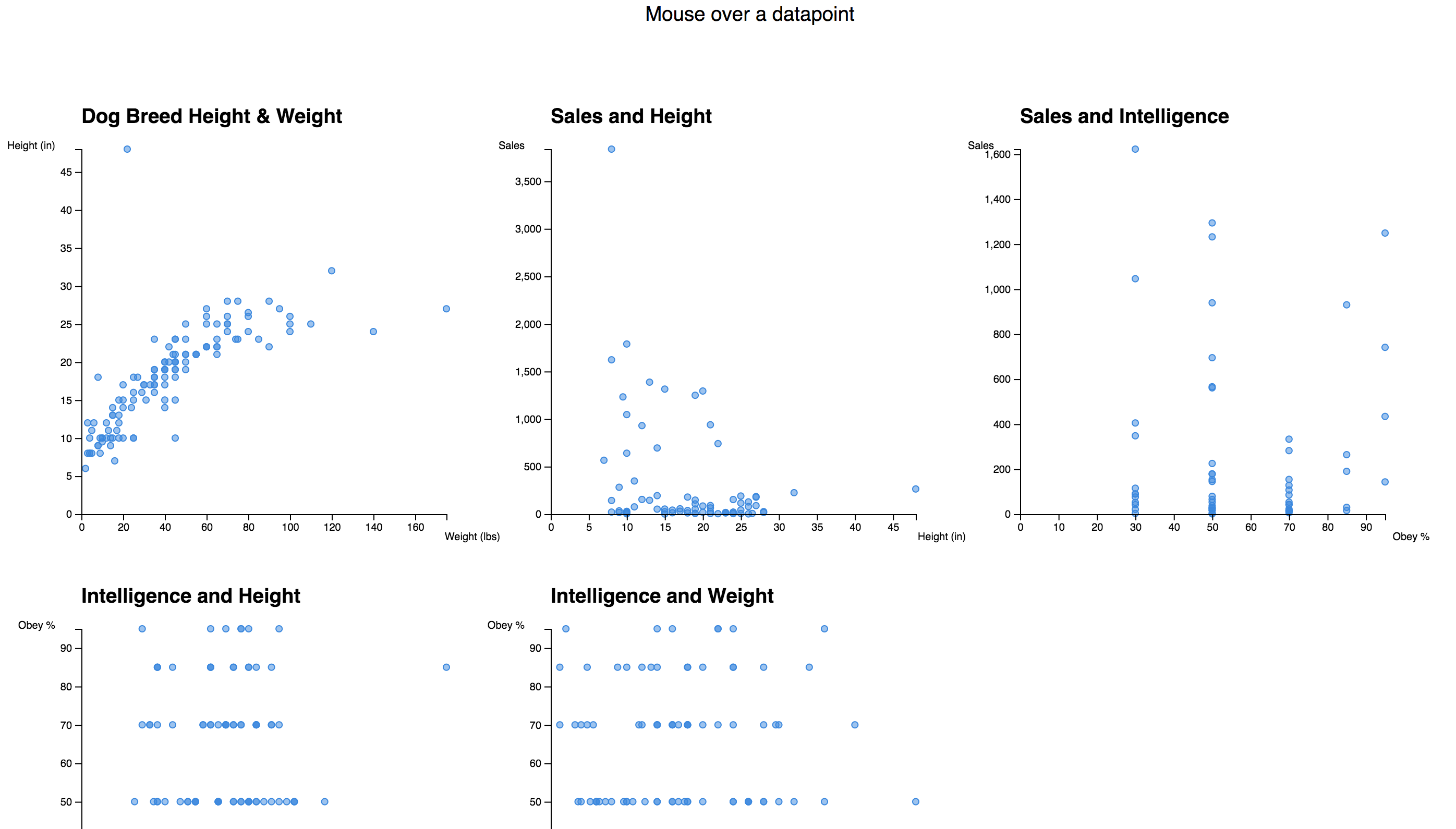
Say you're building a small dashboard. Like of different scatterplots looking at a dataset about dog breeds.
Because the data is there, and you can, of course.
You create a scatterplot component. It takes an x and a y position and sizing info. Inside, it places two axes, a caption, and the datapoints.
The <Scatterplot> is absolutely positioned via a translate transformation. That moves an SVG element by a vector from (0, 0), thus rendering at the (x, y) coordinate.
You render each scatterplot like this:
<scatterplot data={data} x={100} y={100} width={350} height={350} filter="{d" =="">
            d.weight &&
            d.height &&
            d.weight[0] &&
            d.height[0]
        }
        xData={d => d.weight[0]}
        yData={d => d.height[0]}
        xLabel="Weight (lbs)"
        yLabel="Height (in)"
        title="Dog Breed Height & Weight"
        entry={props => (
            <datapoint breed={props.d.breed} {...props}="">
        )}
    />
</datapoint></scatterplot>
A lot of arguments, I know. Data, positioning, sizing, functions for interpreting data, a few labels, and a render prop for each datapoint.
Once positioned with a grouping element <g>, the scatterplot can use quasi-relative positioning for its elements.
render() {
    return (
        <g transform="{`translate(${x}," ${y})`}="">
            <heading y={-25}>{title}</heading>
            {data.map(d =>
                entry({
                    x: xScale(xData(d)),
                    y: yScale(yData(d)),
                    d: d
                })
            )}
            <axis scale={xScale} x={0} y={height} type="Bottom" label={xLabel}>
            <axis scale={yScale} x={0} y={0} type="Left" label={yLabel}>
        </axis></axis></g>
    );
}
Position the main container at x and y. Place Heading at (0, -25), datapoints at wherever they go, one axis at (0, 0), and another at left bottom. All relative to the parent container.
The parent container is technically relative to the whole SVG container ... 🤔
Absolute or relative, doesn't matter. You're gonna have one hell of a fun time calculating the position of each individual element by hand. D3 scales help, but you still have to think about it.
SVG itself offers zero help.
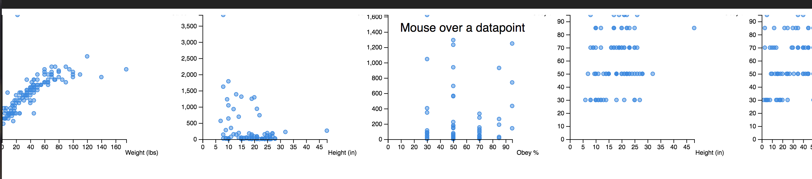
Want to resize your scatterplots? Here's what happens 👇
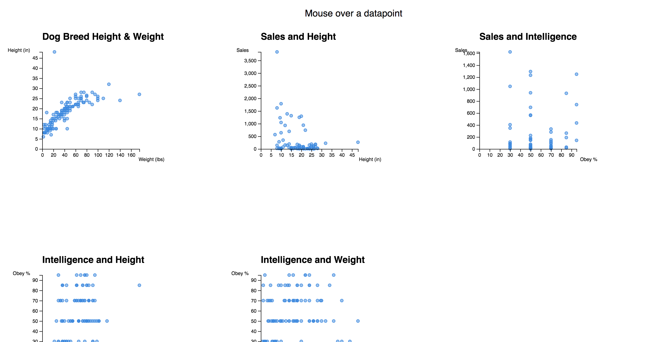
Want to resize your browser? Here's what happens 👇
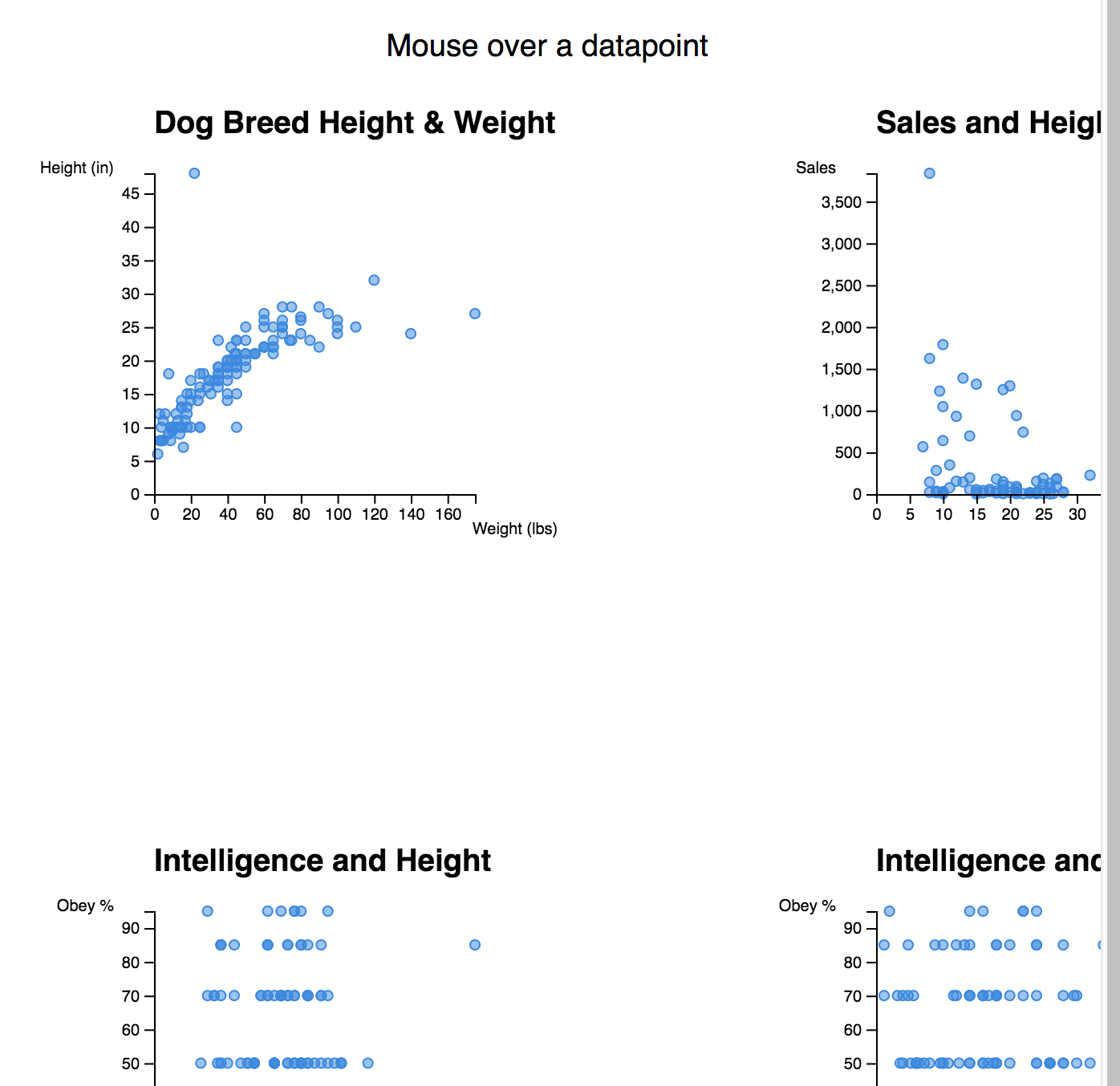
Ugh.
react-svg-flexbox to the rescue
You can fix the layouting problem with react-svg-flexbox. It's a small library, not a lot of stars, but omg so perfect.
Built on top of Facebook's css-layout, which has recently become a part of yoga, it lets you use CSS flexbox to position SVG elements.
Flexbox might be confusing to grok – I look at tutorials any time I use it for anything – but it's way better than doing it yourself. How many engineers worked on browser layout engines over the past two decades?
Wouldn't wanna retrace all those steps yourself 😅
Wrap our dashboard in a <Flexbox> element and…
import Flexbox from "react-svg-flexbox";

// ...

// render() etc.
<svg>
    <flexbox style={{ flexdirection: "row", justifycontent: "flex-start" }}>
        <scatterplot data={data} width={200} height={200} filter="{d" =="">
                d.weight &&
                d.height &&
                d.weight[0] &&
                d.height[0]
            }
            xData={d => d.weight[0]}
            yData={d => d.height[0]}
            xLabel="Weight (lbs)"
            yLabel="Height (in)"
            title="Dog Breed Height & Weight"
            entry={props => (
                <datapoint breed={props.d.breed} {...props}=""></datapoint>
            )}
        />
</scatterplot></flexbox></svg>
We take <Flexbox> out of react-svg-flexbox, use flexbox styles to say we want to render in a row that starts at the beginning, and the rest happens on its own.
Note that react-svg-flexbox passes x and y props into our components, so we had to take out manual positioning. Our dashboard now uses up all the space it can 👇
Something's funky with our vertical positioning, but it's an easy fix. Offset y coordinates by a few pixels. ¯_(ツ)_/¯ it's not happening in the official examples, so it must be something we're doing inside those scatterplots.
The axes are still poking outside our width bounds, but this looks better already.
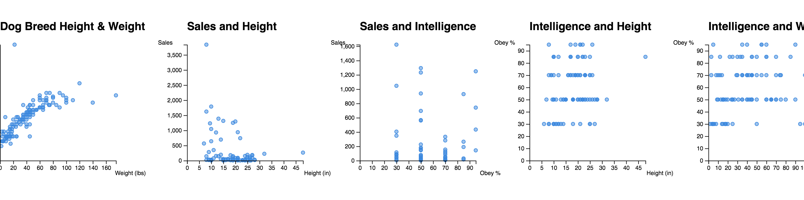
Even if we make one of them bigger, everything still works. No changes to positioning required! o/
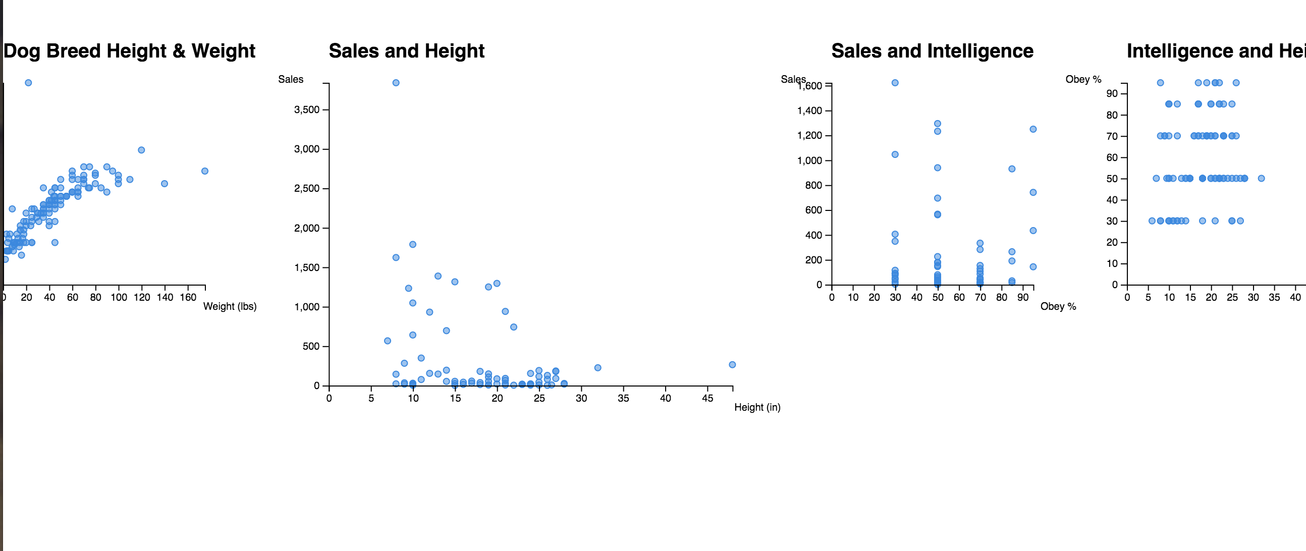
Responsive layout with react-svg-flexbox
For the biggest win, we add flexWrap: wrap to our <Flexbox> component. Like this 👇
 <flexbox 1024="" style={{ flexdirection: "row", justifycontent: "flex-start", flexwrap: "wrap", width: 1024, height: }}>
</flexbox>
You have to specify available width in your styles, otherwise, it doesn't work. That means you should listen to window.onresize and update width accordingly.
Easiest to attach an event listener in componentDidMount. Like this:
class App extends Component {
    state = {
        width: 1024
    };

    svgRef = React.createRef();

    componentDidMount() {
        window.addEventListener("resize", this.updateSize);
    }

    componentWillUnmount() {
        window.removeEventListener("resize", this.updateSize);
    }

    updateSize = () => {
        this.setState({ width: this.svgRef.current.clientWidth });
    };

    render() {
        // ...

        <svg 1024="" style={{ width: "100%", height: }} ref={this.svgRef}>
            <flexbox 1024="" style={{ flexdirection: "row", justifycontent: "flex-start", flexwrap: "wrap", width: this.state.width, height: }}>
    }
</flexbox></svg>
And your dashboard becomes responsive! Yay
Hey look, a responsive dataviz dashboard made with React. It's all one big SVG 🤘
— Swizec Teller (@Swizec) August 17, 2018
Article out tomorrow pic.twitter.com/4hgMOYXqaL
See the code, play with examples
You can see a full set of react-svg-flexbox examples on their Storybook.
Code for my dog breed dashboard example is on GitHub here.
You can try it live here.
Fin
Use react-svg-flexbox. Your life will improve. The best thing that's ever happened to me for SVG coding.
Thanks Cody Averett for finding this gem 💎
Continue reading about Build responsive SVG layouts with react-svg-flexbox
Semantically similar articles hand-picked by GPT-4
- Build an animated pure SVG dynamic height accordion with React and D3
- JavaScript’s most popular dataviz library
- Livecoding Recap: A new more versatile React pattern
- Tiny React & D3 flamegraph tutorial
- Tooltips and state across various d3 charts in a React dashboard!
Learned something new?
Read more Software Engineering Lessons from Production
I write articles with real insight into the career and skills of a modern software engineer. "Raw and honest from the heart!" as one reader described them. Fueled by lessons learned over 20 years of building production code for side-projects, small businesses, and hyper growth startups. Both successful and not.
Subscribe below 👇
Software Engineering Lessons from Production
Join Swizec's Newsletter and get insightful emails 💌 on mindsets, tactics, and technical skills for your career. Real lessons from building production software. No bullshit.
"Man, love your simple writing! Yours is the only newsletter I open and only blog that I give a fuck to read & scroll till the end. And wow always take away lessons with me. Inspiring! And very relatable. 👌"

Have a burning question that you think I can answer? Hit me up on twitter and I'll do my best.
Who am I and who do I help? I'm Swizec Teller and I turn coders into engineers with "Raw and honest from the heart!" writing. No bullshit. Real insights into the career and skills of a modern software engineer.
Want to become a true senior engineer? Take ownership, have autonomy, and be a force multiplier on your team. The Senior Engineer Mindset ebook can help 👉 swizec.com/senior-mindset. These are the shifts in mindset that unlocked my career.
Curious about Serverless and the modern backend? Check out Serverless Handbook, for frontend engineers 👉 ServerlessHandbook.dev
Want to Stop copy pasting D3 examples and create data visualizations of your own? Learn how to build scalable dataviz React components your whole team can understand with React for Data Visualization
Want to get my best emails on JavaScript, React, Serverless, Fullstack Web, or Indie Hacking? Check out swizec.com/collections
Did someone amazing share this letter with you? Wonderful! You can sign up for my weekly letters for software engineers on their path to greatness, here: swizec.com/blog
Want to brush up on your modern JavaScript syntax? Check out my interactive cheatsheet: es6cheatsheet.com
By the way, just in case no one has told you it yet today: I love and appreciate you for who you are ❤️